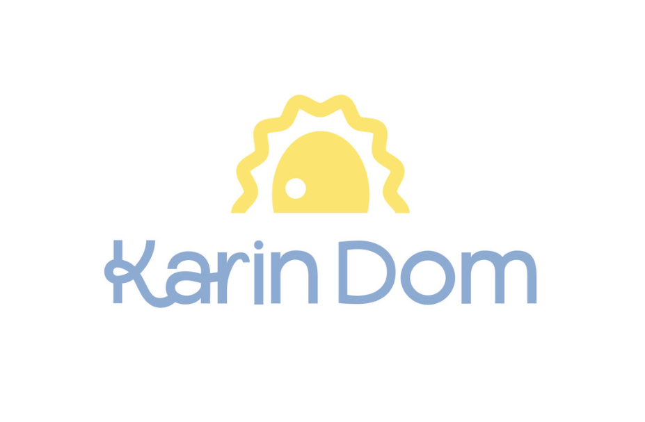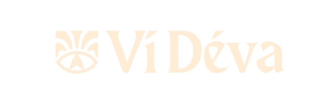
A rebrand project I did for a design competition for a non-profit organization in Bulgaria that helps children with special needs and their families by supporting and educating them. The organization has used their logo for over 25 years now and want to keep the sun as an element in their new logo. They want to be seen as a welcoming home that would bring light and happiness into people's lives.
Old Logo

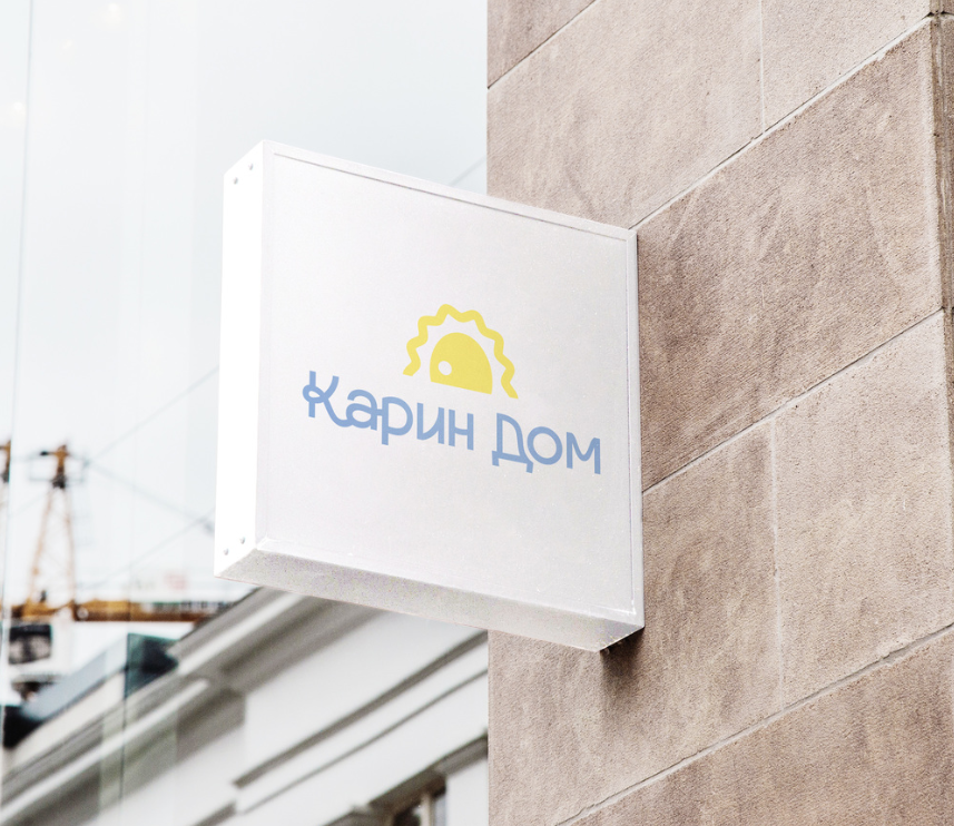
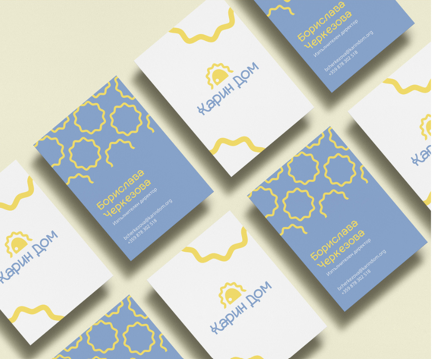
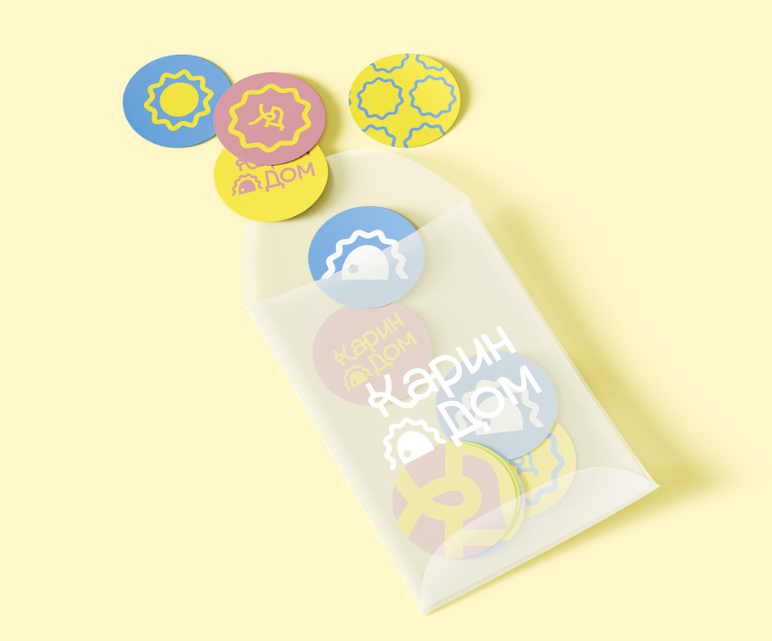
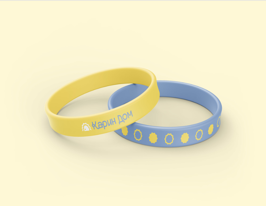
Solution
My idea was to make the logo look more up to date while still keeping the necessary elements. I used the sun as the logo icon and by adding a little negative space inside it I managed to create the association of a door as well, symbolizing the home and coziness that the organization offers. The zig-zag line that is used for the sun rays will later be used in different visual materials to create a cohesive and recognizable visual identity. I've used a sans serif font to give it a more modern and friendly look. The flowy lines also add a more playful feel which suits an organization that is targeted towards children and their families.